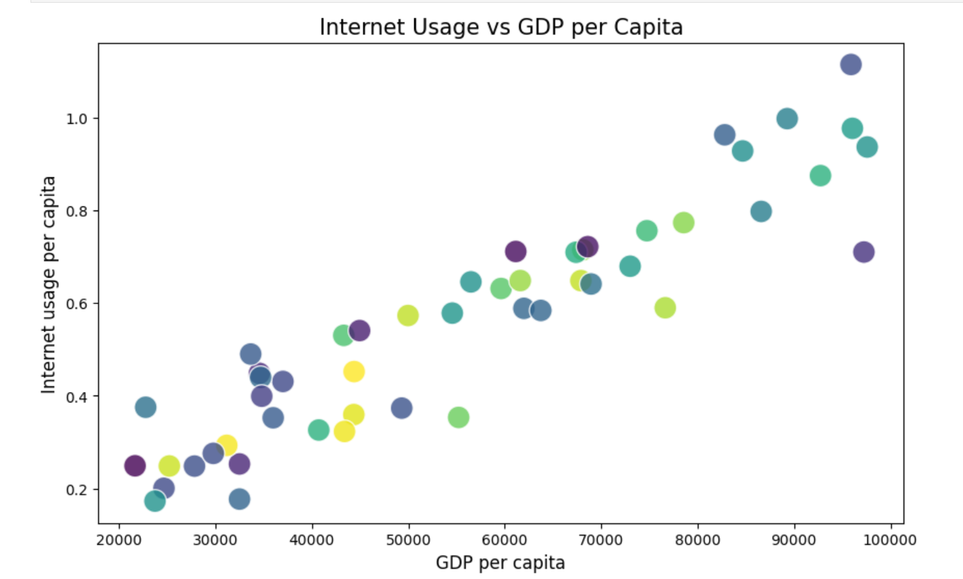
Creating powerful visuals doesn’t have to be complicated. Whether you're using Python (Matplotlib) or Excel, these five tips will help you build impactful plots that communicate your message effectively:
- Choose colours thoughtfully:
- Excel: Use the "Format Chart" options to choose from a range of colour palettes, and ensure you stick to complementary or contrasting colours. You can also use the "Change Colours" feature to apply a consistent scheme across your plot.
- Python (Matplotlib): Use the plt.scatter() or plt.plot() functions with the c or color parameter. You can also use predefined colour maps like plt.cm.coolwarm for consistency.
Adding colour in python:
plt.scatter(x, y, c='darkblue') # or use color maps like 'cmap=plt.cm.viridis'2. Use consistent scales:
- Excel: Ensure that the scales of your axes are consistent by right-clicking on the axis, selecting "Format Axis", and setting the same range for related plots.
- Python (Matplotlib): You can fix axis scales using plt.xlim() and plt.ylim() to maintain uniformity across multiple graphs.
Set axis limits in python:
plt.xlim(0, 100)  # Set consistent limits for x-axis
plt.ylim(0, 50)   # Set consistent limits for y-axis
3. Label clearly:
- Excel: Use "Chart Elements" to add axis titles and chart titles. Ensure the text is descriptive and easy to read.
- Python (Matplotlib): Use plt.xlabel(), plt.ylabel(), and plt.title() to add meaningful labels to your plots.
Creating axis labels in python
plt.xlabel('X Axis Label')
plt.ylabel('Y Axis Label')
plt.title('Descriptive Chart Title')
4. Simplify the design:
- Excel: Remove gridlines and unnecessary elements by right-clicking on them and selecting "Delete" or unticking "Gridlines" in the Chart Elements menu.
- Python (Matplotlib): Use plt.grid(False) to turn off gridlines and avoid adding excessive plot markers or 3D effects.
Remove gridlines
plt.grid(False) # Disable gridlines for a cleaner look5. Highlight key data:
- Excel: Use "Conditional Formatting" to apply bold colours to specific data points or right-click on key data series and choose "Format Data Series" to customise its appearance.
- Python (Matplotlib): You can pass a specific colour to certain data points or use the alpha parameter for transparency. Highlight specific points by using a different marker style or colour.
Highlight key data in python
plt.scatter(x, y, c='lightgrey')  # Default
plt.scatter(x[important], y[important], c='red', s=100)  # Highlight key points
Make your visuals as clear as your message! 🎨📊
#datavisualisation #python #excel #treasury #AI #finance #analytics
